
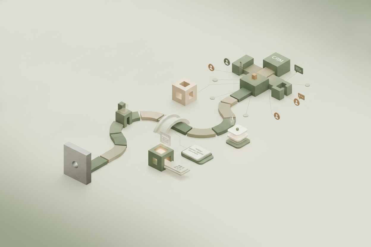
A successful thank you page transforms a dead-end confirmation into an active conversion path by setting clear expectations, offering a single logical next step, and passing user context directly to your sales team. When a visitor submits a form, they have reached a peak moment of interest and trust. Abandoning them with a generic, static message is a missed opportunity that stalls the momentum of your lead nurturing process. By rethinking this critical touchpoint, you can guide prospects deeper into your brand’s story while preparing them for a meaningful human connection.
In digital marketing, every interaction should feel like a natural conversation. A well-designed thank you page is not just a technical confirmation; it is an essential component of a thoughtful UX strategy. It respects the user’s time by immediately validating their action and offering immediate, relevant value that keeps them engaged on your website rather than sending them back to a search engine results page.
The missed opportunity of generic confirmation screens
Standard confirmation pages that merely state we have received your message halt the customer journey at its moment of highest engagement. By treating this screen as a dead end, businesses lose a critical chance to deepen trust and guide high-intent leads toward the next logical step.
When a user fills out a form, their attention is entirely focused on your brand. They have just made a conscious decision to share their personal information, which is a significant psychological hurdle. Displaying a simple, uninspired sentence of gratitude acts as a sudden stop sign, breaking the conversational flow and leaving the user wondering what happens next.
Instead of letting this momentum dissipate, forward-thinking organizations treat this post-submission screen as an active portal. By maintaining a consistent design aesthetic and a welcoming tone, you can reassure the user that their data is safe and that their journey with your company is just beginning.
How does an optimized thank you page accelerate lead nurturing?
An optimized thank you page accelerates lead nurturing by immediately delivering valuable, context-specific resources that address the user’s current challenges. Instead of waiting for an email, the prospect continues their educational journey right on your website, building immediate brand authority.
By analyzing the specific form the user submitted, you can tailor the content on the subsequent screen to match their exact interests. If a visitor requested a guide on digital marketing, the confirmation screen should offer related case studies or a quick video explaining key concepts. This immediate delivery satisfies their curiosity and reinforces your position as an expert resource.
To keep this interaction respectful and low-friction, smart websites often pair these post-submit experiences with progressive profiling on B2B lead forms, which builds trust by asking only one new question per visit instead of demanding a massive initial interrogation. This gradual approach keeps the initial conversion path clean and inviting, ensuring more users actually reach your high-value thank you screen.
Setting clear operational expectations to reduce prospect anxiety
Clear communication on a thank you page reduces prospect anxiety by outlining the exact next steps of your operational process. Telling a lead who will contact them, how they will reach out, and the precise timeframe prevents them from seeking alternative solutions elsewhere.
Uncertainty is a major conversion killer in modern business-to-business relationships. When a prospect submits a request for a consultation, they often worry about receiving spam or being ignored entirely. By clearly stating what happens behind the scenes, you build immediate credibility and set a professional tone for the entire relationship.
This transparency works best when backed by internal discipline. Establishing a strict operational SLA for lead response after a form submission is the single most effective way to improve inbound marketing conversion rates, ensuring that the promises made on your screen match actual team performance. When your digital interface and your operational team work in harmony, the prospect experiences a seamless transition that builds immense confidence.
What is the single next step you should offer on a thank you page?
The single next step on a thank you page should be a low-friction, high-value action that aligns with the user’s original intent, such as scheduling a meeting, downloading a related guide, or watching a product demonstration. Offering too many choices causes decision paralysis and dilutes focus.
While it is tempting to present a variety of resources, social media links, and newsletter sign-ups all at once, this approach often overwhelms the visitor. A focused UX design directs the user’s attention to one primary call to action. This action should feel like a natural extension of the form they just completed, rather than a jarring pivot to an unrelated topic.
For example, if a user has just registered for an educational webinar, the most logical next step is to offer an easy button to add the event to their digital calendar, followed by a single recommended article that prepares them for the upcoming discussion. This keeps the interaction focused and highly productive.
Passing user context to sales for a highly personalized follow-up
Passing the context of the thank you page interaction to your sales team ensures that the subsequent human outreach is highly personalized and relevant. When sales representatives know exactly what content the prospect engaged with post-submission, they can skip generic introductions and address specific pain points.
Modern marketing automation systems can track which buttons are clicked and which videos are watched on the confirmation screen. When this behavioral data is passed directly into your customer relationship management system, it arms your sales team with invaluable insights. Instead of a cold, repetitive follow-up, the representative can reference the specific case study the prospect viewed.
This deep integration also helps close the loop with your marketing efforts. Implementing a CRM integration that feeds qualified lead stages back to ad networks stops ad platforms from optimizing for low-quality junk leads, allowing algorithms to focus on actual business value. By connecting your post-conversion user experience directly to your sales data, you create a unified system that improves both lead quality and conversion efficiency.
How can you measure the performance of your post-submission UX?
Measuring the performance of your post-submission UX requires tracking secondary conversion actions, scroll depth, resource downloads, and subsequent email open rates. A successful thank you page is evaluated not just by its loading speed, but by how effectively it deepens prospect engagement.
Many organizations make the mistake of only measuring the initial form submission rate, ignoring what happens immediately afterward. By setting up specific event tracking in your analytics tools, you can monitor how many users click the secondary call to action on your confirmation screen. A high click-through rate here indicates that your content is highly relevant and engaging.
Additionally, monitoring the time spent on this page can reveal whether users are actually reading the information provided or simply closing the tab. If users are leaving within seconds, it may be time to simplify the layout, use more engaging visual elements, or refine the copy to make it more compelling and easier to digest.
Refining the post-conversion experience for long-term customer relationships
Refining the post-conversion experience transforms a brief transactional touchpoint into the foundation of a long-term customer relationship. By treating the thank you page as an active portal rather than a passive receipt, businesses demonstrate respect for the user’s time and attention.
Every touchpoint in the customer journey contributes to the overall perception of your brand. When you invest effort into crafting a thoughtful, helpful, and clear post-submission experience, you signal to your prospects that you value quality and detail. This subtle reassurance can be the deciding factor when they choose between you and a competitor.
By continuously testing and optimizing this screen, you ensure that your marketing funnel remains efficient, respectful, and highly aligned with your business goals. If you would like to discuss how to transform your website’s confirmation screens into active, high-performing touchpoints, we are always here to share a warm, practical perspective on your digital strategy.
FAQ for this article
-
How can a thank you page improve lead quality?
-
What elements should be included on a high-converting thank you page?
-
How do you pass thank you page context to your sales team?
-
Why is a single call to action better than multiple options on a thank you page?
-
How does improving the thank you page UX affect overall marketing ROI?