
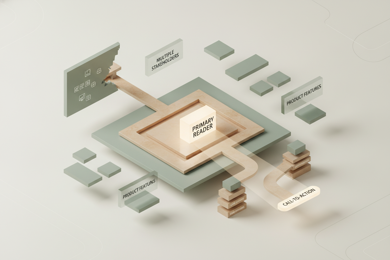
When a B2B website attempts to speak to every possible stakeholder at once, it invariably ends up speaking to no one. Founders and marketing executives frequently enter a website redesign with a desire to showcase every capability, product feature, and target persona directly above the fold. However, diluting your messaging across multiple buyer profiles dilutes your positioning, increases user friction, and suppresses primary conversion rates. A successful DACH SMB homepage strategy requires radical focus: identifying one primary buyer persona, guiding them toward one primary conversion action, and offering authentic evidence long before polishing design aesthetics.
Building a high-performing digital platform is fundamentally an exercise in prioritization. Decision-makers in medium-sized enterprises do not browse business websites for leisure; they seek fast, credible confirmation that your organization understands their technical and operational challenges. When your homepage presents five competing banners, conflicting navigation links, and vague generic promises, visitors exit within seconds. By aligning your entire hero section around a single operational problem, you instantly signal expertise, reduce cognitive overload, and establish clear conversion paths for your high-intent traffic.
In this article, we outline the structural decisions required to transform a scattered marketing layout into a direct growth engine. We will explore how to identify your true primary reader, how to construct conversion paths that lower user friction, and how to deploy proof points that build lasting trust across the DACH market.
The Cost of Diluted Positioning on your Homepage
Attempting to appeal to enterprise executives, technical managers, HR recruiters, and prospective investors simultaneously creates a cluttered user experience. When every department inside your organization demands front-row real estate on the index page, the central value proposition vanishes entirely. Visitors encounter conflicting headlines, generic jargon, and ambiguous calls to action, which forces them to work unnecessarily hard to evaluate your solution.
For a regional DACH SMB, clarity always beats corporate grandeur. German-speaking decision-makers prioritize precision, security, and proven competence over broad marketing claims. If an IT director or operations lead visits your domain and cannot determine within five seconds whether your service addresses their specific environment, they will bounce to a competitor. Concentrating your initial messaging on a single core audience profile gives your brand immediate credibility and keeps high-value prospects engaged throughout the site.
Who Is your Primary Buyer on the Digital Stage?
Identifying your primary reader requires separating your total addressable market from the specific individual who initiates the buying conversation. While multiple stakeholders will ultimately participate in a corporate procurement decision, only one persona acts as the primary explorer on your website. Designing your main page around this primary driver ensures your value proposition cuts through administrative noise.
To isolate this profile, analyze your recent historical sales data. Determine which role consistently discovers your solutions, books the initial introductory exchange, or submits the preliminary inquiry. If executive leadership signs the contract but technical project managers conduct the preliminary research, your digital platform must speak directly to the technical project manager’s immediate day-to-day friction points. Secondary audiences can easily find detailed support information through clear, organized secondary navigation items.
Designing Conversion Paths around One Clear Primary Action
Every element on your main landing canvas should guide the user toward a single primary call to action. Presenting competing options—such as inviting users to download a whitepaper, watch a demo, subscribe to a newsletter, and schedule a call within the same viewport—paralyzes decision-making. High-converting B2B website structures guide visitors down a single, intuitive path tailored to their current buying stage.
However, demanding a full sales consultation or software demo immediately can backfire if your brand has not yet established sufficient credibility. Pushing enterprise decision-makers to commit their time too early often creates friction during long prospective cycles. You can explore how offering lower-friction digital interactions builds audience trust naturally by reviewing our guide on micro-conversions for B2B demo requests, which explains how step-by-step engagement nurturing outperforms aggressive upfront pitches.
How Do You Build Real Proof Before Applying Visual Polish?
Visual aesthetics, modern typography, and refined graphic assets elevate your corporate image, but they cannot compensate for missing operational evidence. Business buyers in Germany, Austria, and Switzerland expect concrete proofs: verified case studies, specific performance metrics, third-party certifications, and identifiable client references. Structuring your evidence effectively before refining your interface ensures your aesthetic design serves a meaningful structural purpose.
Place concrete validation markers close to your main messaging statements and strategic interaction buttons. Rather than writing abstract claims about industry leadership, display tangible results, such as percentage efficiency gains or specific implementation timelines achieved for existing clients. Authentic proof points eliminate perceived risk, validate your service pricing, and reassure conservative corporate buyers during their internal evaluation processes.
Structuring the Narrative Arc of a High-Converting Homepage
A high-converting web structure follows a deliberate psychological progression designed to address buyer objections sequentially. The initial viewport must clearly declare what you do, who you serve, and what immediate outcome you deliver. Immediately following the hero section, neutral client logos or validation trust marks should validate your preliminary declaration.
The central body section should then systematically unpack the core problem, outline your unique technical approach, and present detailed evidence of successful execution. For complex B2B solutions across multiple sectors, presenting tailored evidence efficiently is critical. You can learn how to implement modular layouts without overwhelming your content architecture in our deep dive on scaling vertical landing pages without CMS bloat. Finally, close your narrative with a single, clear next step that reinforces your primary call to action.
What Role Does Analytics Play during a Website Redesign?
Launching a redesigned corporate platform without baseline telemetry is akin to navigating without instruments. Before committing to a complete structural overhaul, your marketing leadership must understand how current site visitors navigate your content, where drop-offs occur, and which sections capture meaningful interest. Data-driven adjustments prevent your team from making subjective visual choices during site development.
Integrating systematic tracking from the very first deployment phase ensures your ongoing optimization efforts remain anchored in real user behavior. To avoid common tracking omissions and measure performance accurately right after launch, explore our checklist covering essential analytics hooks for marketing site launches. Capturing clean event data around call-to-action interactions and key scroll thresholds enables continuous, measured homepage optimization over time.
Aligning Internal Stakeholders around Focused Web Strategy
The greatest barrier to a simple, focused website layout is internal organizational politics. Sales teams want direct lead forms, HR demands open job listings on the main banner, product managers want feature roadmaps highlighted, and executive leaders request corporate milestone announcements. Accommodating every internal request produces a disjointed experience that serves internal egos rather than customer needs.
Overcoming this internal friction requires leadership commitment to user-centric digital standards. Remind internal departments that your primary index page acts as an inviting digital foyer, not a complete company archive. Dedicated subpages, focused landing modules, and structured secondary navigation exist precisely to serve specialized internal needs without compromising the primary buyer’s user journey on your core domain.
Refining your digital presence is an ongoing process of simplifying narrative structures and validating conversion hypotheses. If you are planning an upcoming digital refresh and want to clarify your core homepage strategy, we are always open to a thoughtful exchange about your goals.
FAQ for this article
-
Why is targeting multiple buyer personas on a single homepage problematic?
-
How do we identify our single primary buyer persona for a website redesign?
-
What primary call to action should a DACH SMB display above the fold?
-
Why is social proof more critical than complex site visual design?
-
How should B2B companies handle internal pressure for extra homepage links?